Superficiality Is A Place I Go

An unpublished essay written by Georgia in 2016.

Superficiality Is A Place I Go

Prologue

///

My grandmother Shirley was survived by her third husband Sam by nearly four years, and when he finally died, it was the last time to empty the house. Though prior to her death she had attempted to give my sister and I everything, this proved difficult in the distance between Boston and South Florida (picture airport security ripping open a mysterious and meticulously packed box of crystal Ralph Lauren rocks glasses, or a carry-on tote filled awkwardly with high-heeled shoes and leather Falci purses.) Understandably, the large items never made it on the plane, you know, furniture, mirrors, rugs, things like that. Anyways several months later it was last call;

was there anything I wanted from the house, before the estate sale began, or before the trucks hauled everything off to Goodwill? I have a happy memory of the sunroom off that house, a long, shining, white-tiled room surrounded by glass at the edge of a golf-course; in the center was a kind of perfect still life; a white wicker chaise with white cushions, a stack of magazines probably on top of a white garden seat, and the flat black and white Zebra rug, adding a little Chinoiserie drama to the stark white room; it was beautiful, and profoundly Palm Beach.  Of course I wanted the rug.

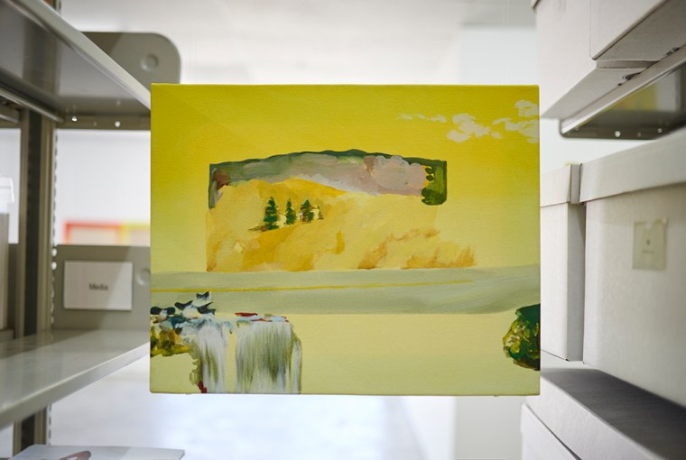
Some time later I opened a badly-handled cardboard box to find a large, floppy and incomprehensible thing in my hands. Holding it up in front of me, I had no idea what it was. It could have been moments or hours before I realized it was my rug, from the sunroom, from the sunroom by the chaise. Up close and tactile, removed from my mind and put into my hands, its Palm Beach glamor faded; and then as I laid it on the floor it returned. This thing in my mind called rug was hardly a rug at all; it was a painting, that we walked on. In a way there aren’t really words to describe what this means to me. After all these years I’ve become an artist, and a decorator of sorts, too, unable to give up either.  I miss everyone and everything from that time.  

///

Picture an office in a basement somewhere; gritty drop-ceiling, leak stained and brown-ish; half-burned out fluorescents behind that thick textured plastic effecting a dull, unflattering light; and a deep, hollow silence, like pressing your ear to the opening of a seashell. What’s weird, or unique, about seashells is that they sound like the ocean, which is where they came from; as displaced objects they embody not just the physical trace of their origins, but the aural one, too; for me it’s the sound inside the shell that becomes transportive, and in this sense I think of it as a memory. The space we’re standing in is A402, a CalArts campus gallery that defies logic in its non-conventionality, at least for institutional purposes. There’s no track lighting, the ceilings are low and distracting, and there’s that half-ocean half-ghost sound, whistling and gently rattling through different shapes of pipes and other ventilation, all out of sight. I’m trying to say you can’t stand in this place and really be here. Everything about it is completely unstable. It resists gallery-ness, office-ness, art-ness, grounded-ness generally. To me it is a space that remakes itself in every incarnation, and I have never entered it twice and seen it in the same way. By nature of its architecture, its disrepair, its noisiness, it is in a constant state of re-imagination. It reminds me of a kind of thought space I could only inhabit when I was a child, when tin foil and toilet paper tubes could be a rocket-ship, and a boiler room could be outer space.

Ibai’s show begins by a semi-obstruction of the gallery doors, where a towering triangular particle board and black vinyl object stands on casters. Exceeding the height of A402 itself, this object isn’t inside the gallery, and it never can be. It has the potential for mobility, the potential for un-obstruction; but in its unfamiliarity as an object it becomes scary, almost uncanny, and no one wants to touch it. It’s on the verge of fitting into an art vocabulary, but I can hardly describe it to you. It’s almost like a giant particle board bookshelf on wheels, only it has no back or sides, and there is a long piece of vinyl which has been painted black and stretched over the object, which must be nine feet high. Impressed or painted onto the vinyl are two crosses, barely visible depending on the light. Seriously, this object is barely comprehensible, a kind of sculptural rabbit-duck illusion. Here are my first impressions: sound bouncer/blocker; light bouncer/blocker; apparatus for stretching/painting rolls of clear vinyl; sex toy/object; religious object; ritual object.

The rest of the show is not possible to describe in detail. Ibai has designed a stage that juts out into the gallery; made of particle board, it is many-sided, and has a few things sticking up out of it–a mic stand, a drum, a giant speaker made of the same particle board, a white LED stick–the stage has no sides, we can see everything underneath it, including a pile of wires. Though the space beneath the stage is dark, the pile of wires is lit by the white LED. A flat-screen monitor placed perpendicularly to the stage sits on the floor in the corner, playing a 7 minute video loop.  The video is of a staged-looking rehearsal, where a few different performers sing the nonsense phrase “I laugh if I doodle dah day” in varied styles; the camera pans across the bunched-up fabric of a piano cover, and zooms into a few of the performers’ clothes. As the video loop ends, audio begins from the giant speaker tower; the sound is something between the score for a dramatic movie and a drum circle, increasing in intensity as the music plays on. Lastly a few of the clear ceiling light tiles have been replaced with red plastic and the rest of the lights removed; this washes the space in an eerie red light; the back of the gallery is the darkest light, the middle the redist light, and back the whitest light. Outside the show is the regular institutional light, along with the giant incomprehensible object.  

Picture another office-ish looking room, same drop ceiling, but cleaner, same lighting, but more of it; this room is big, it’s carpeted with a system of tiles in something black-speckled and resilient, utterly replaceable; it’s filled with chairs, more chairs than you could need, never stacked, just rearranged, pushed out of the way, or pulled closer. They dictate the space by making it less navigable, sometimes treacherous, you’re surrounded by a disarray of empty chairs. The walls here are white and fairly smooth, mainly because they’re concrete, and nearly impossible to nail into, though some do try, and succeed. There are two entrance doors diagonally across from each other, and one closet which looks so much like an exit that a sign above it reads “not an exit”; this has the effect of making the room feel like it’s floating in the middle of the school, since one could exit from nearly any wall. This is F200, a CalArts classroom with the odd ability to mean nothing to no one, despite years of famous teachers and lecturers, countless critiques and arguments, and the endless numbers of student artworks hauled through its doors and hung with tape from its impermeable walls. 

If A402 is like a seashell, then F200 is like a church basement. As an art-space it’s a visual conundrum, as an institutional space it’s like a prison for toddlers. Almost no artwork can escape the room’s psychological drain. Has an artwork ever looked good, let alone felt good, in this room? No, but in this sense it asks us to use our imagination, and we always do; the room has this magic, for sure, but it is a dark magic.

My drawing is a triptych, pen and pencil on stonehenge, 30”x40”. From left to right, the first is a  horizontal pen and pencil drawing of a messy bed in a large bedroom. It could be a hotel room, but it’s probably not, because of some framed pictures on the nightstand, and a few other personal items that would be out of place in a hotel room. There are lots of pillows in this drawing, and some of the things are only halfway drawn, and other things have a lot of pencil lines around them, with a lot of smudging and eraser marks. The style is mainly contour, very graphic looking, with no shading to speak of; there is the occasional all-inked surface of the paper where an object’s shadow might be, or an invented shadow. The middle drawing is vertical and contains, in about 1.5 inch letters drawn and shaded in with pencil, the following thought: 

Start with really earnest writings and then go back and edit them to be less embarrassing. The more you write about your family the more your whole art practice turns to mush. People say you should bring sex back into your work.  Therapists say sometimes people want sex as a substitute for something else, probably attention. Either way the desire for it represents something else, and this thought can make sex undesirable and disappointing.

The registration lines on this are faint but visible, and the words are almost level across the page, but start to angle slightly up toward the end. The last drawing in the triptych is hung horizontally again, and is also a pen and pencil drawing of a messy bedroom. The perspective indicates that either we’re closer to the bed, or the room is much smaller.  Overall this drawing is stylistically similar to the first one, but even less finished looking.

The scale of the triptych is impressive, and the drawing style works to blur the line of what may be considered finished, or complete. There is a transparency to these drawings, which are unconcerned with showing eraser marks or pencil smudges, or revealing the process of their making. In some ways they are a total mess, and in some ways, to some, this might give them a subtle beauty.  

///

Art is made up of much of the same language as objects. Traditionally, different artistic disciplines have been concerned with different problems. For example, painting is concerned with surface. Sculpture is concerned with volume.  Later in history they converge, but it’s not difficult to look around and find them separated again, if not literally, than in the passive seedbeds of our minds. In post-modernity, arguably, painting isn’t a higher art than sculpture; abstraction is not more avante-garde than illustration. But language permeates our bones, and the hierarchy is present in the language. Ibai’s show, in A402, with the hollow seashell sound, its premise is depth, different kinds of depth.  The stage bifurcates the space by reminding us that there is an above and a below, not just of his stage but of the very ground we stand on. There is darkness and lightness, redness and whiteness, logic and illogic, inside of sound and outside of sound, comprehensibility, and incomprehensibility. Ibai’s show is the kind of immersive experience that has such a precise balance of factors that it goes beyond depth and into drowning. I will think of it often.

I can’t be a passive observer of my own artwork. Even if I think I can, nobody would believe me. Back in F200, with buzzing fluorescent lights and the sea of chairs, I want to talk about the meaning of superficial. The paper, the lines, the materials, the immediacy of words, of sentence structure, of stating thoughts, of something as basic as “pen” or “pencil”; a clear line for the eye to follow, and a familiar image, in the form of a letter, or a pillow, or a shoe. When you make a drawing, in the most conventional sense, it hangs flat against the wall, or it lays flat in a drawer, or on a table. Flatness is one of its inherent qualities. Chances are you can’t touch or hear the drawing, or interact with it in any way, except with your eyes. For me, this creates a kind of stare down between myself and the artwork, and the inability to touch or taste or have a multi-sensual experience lends such flat things, like drawings, a superficial quality. In a spatial-metaphorical way, flatness echoes flatness, volume echoes volume, depth echoes depth.  The abstract expressionist painters, among others, were fixated on this, too. Think of Rothko, with a giant canvas whose colors recede in both directions at the same time, and also, not at all.  

If Ibai’s artwork drowned me, in that moment, in that space, then in this moment, in this space, my artwork was pushing me away. When I first had this thought, it had a negative feeling. There was depth, and then there was superficiality; in art discourse, and at least in the English language, depth is a measurement, but it is also associated with thought or emotion. To have depth is to be meaningful, serious, maybe poignant. Ibai’s show had all kinds of depth, especially in the metaphysical sense. But if depth is a concept but also, a place, shouldn’t superficiality be a place, too? A place with its own value system, its own possibilities, its own version of depth, not an inverse, but an alternative, next door, not across the hall? I think our minds have been playing a visual and linguistic trick on us. We think of superficiality as a concept, as opposed to a space of inquiry, a space that lies intentionally along a surface, I think of it more like looking at the ocean than swimming, the experiences are different but related, there is mobility between them, and potential, and changes in temperature.  

In my life, space has always been important; the way a room gets laid out, what goes inside of it, if those things can fit through the door, if they’ll look the same in this light or that. In Style By Saladino, Saladino writes:

Every home should be a sanctuary: entering it you should immediately feel physically and emotionally protected.  Inside there should ideally be two different, but equally important, kinds of space that metaphorically might be described as a cocoon and a cathedral.  We all need space that offers comfort and security, and shelter from the cold, noise or darkness outside.  But, paradoxically, we also need space that liberates us from terra firma, allowing our spirits to soar and our imaginations to take flight.

Of course, Saladino was a decorator, and decorating his artform; his style was characterized in his concept of conflating what space meant and what it looked like. His approach to decorating was to have two different, one could say opposite, types of physio-emotional spaces existing simultaneously. And though those spaces had opposite qualities, none was desired more than the other, but both were understood as vital. If this is not a personal philosophy of artistic production, I don’t know what is. What made Saladino a great decorator had little to do with taste and everything to do with belief and passion for a concept; though not every room could achieve this ideal concept, his decorating was aspirational, and for all these reasons, I cannot see it as something separate from art.  

There are a lot of reasons why Ibai’s artwork had depth, and I had superficiality.  Partly it’s the medium, partly the location, partly the different types of labor used in the production of each artwork. I think you could argue that to a different audience, on a different day, Ibai’s piece could have had superficiality, and mine could have had depth;  and on another day, they would have had a different place entirely, and so on. For me, there’s no exact science, no single set or group of parameters, or juxtapositions, to create the perfect space. Sometimes it’s about arrangements, creating the illusion of depth in a small space, or making a huge space feel intimate, or making a huge space feel huge, for that matter. In the 18th century, Chinoiserie was considered by some to be morally ambiguous; in the 21st century, it can be as ambiguous as a rug, or a painting.  

-Georgia Lassner, 2016

Is it currency, or is it art? Cait Finley’s “CAPI 1.0” at De La Studio

It’s an age-old question. Is there an art that gracefully takes up the space of being an object while criticizing the production and sale of objects? Cait Finley’s “CAPI 1.0,” a show of mostly goofy-yet-thoughtful sculptures, all of which may have risen, thriller-like, from a primordial goo, is in good company with a multitude of exhibitions that have materialized no satisfying answer to this question. Instead, “CAPI 1.0” balances itself, rather unstably, on a different sort of question—not so much an age-old philosophical one, but a flamboyant one—fun, treacherous, intellectual, and in vinyl—an awfully big title wall for such a little show. Here it is: “It is good to regard things such as capitalism as physical beings, not simply as fictions that would disappear if we just stopped believing in them. But what kind of physical being are they?” (Timothy Morton, Humankind: Solidarity with Nonhuman People).

Discovering this line and emblazing it with track lights is, in itself, a kind of achievement, since it contains everything a late-capitalist citizen artist yearns for: the word capitalism, for starters, which comes bundled with a built-in critique; the transubstantiation of a non-thing (capitalism) into a “physical being,” with it’s pseudo-religious undertones and delicious potential for myth-making, a la the golem of yore; and of course, the irresistible question-cum-challenge: what kind of physical beings are they? Cait has cleverly (and ironically) positioned this entrance quote not as a theoretical exercise, or even a rhetorical question, but as a question with an actual answer which will, by no coincidence at all, take the form of an objet d’art. I admit, even I was tempted to buy a bag of plaster and a vial of glitter and try my hand at sculpting my own capitalist/monster/fantasy creature.

CAITFINLEY-24
Installation view of “CAPI 1.0.”

To borrow a line from Gordon Ramsey, a critic I admire, let’s get one thing right: the exhibition looks great. The space itself is warm, almost cozy, with white-washed brick and raw wood joists; patches of honey-colored planks emerge through the once-painted moss-green floorboards; and rust-colored paint follows the perimeter of the room and finds its way onto bits of metal strapping. The built-in credenza is all clean lines, and the shelves are neat little slabs of salvaged-looking wood sitting atop simple metal brackets. The lighting, too—not on tracks, but white enamel pendant lamps, and the occasional, well-placed clip light. 

Set lightly, even gently, on these simple but elegant store fixtures, is the stuff of “CAPI 1.0”; hand-held-sized sculptures occupying the same amount of space as, say, a high-end purse, or a hand-made fruit bowl. Where we might expect to find these sorts of boutique-friendly items, rendered in calf skin, or hand-painted in oxides, instead, we find the vulgar materials of art. There is a naked plaster cast of a hand emerging out of a rock formation; an igloo-shaped hunk of plaster with flecks of pastel something-or-other; a peach-painted plaster rock formation with a painted blue arm thing set into the center; a pillow-shaped hunk of plaster bisected to reveal more orange, pink, and purple flecks, reminiscent of my favorite deli meat, mortadella. There’s also a fist-sized hunk of aqua-colored coral set inside a block of clear resin—an object which, like the others, could be mistaken for a notable paperweight, or perhaps, for the heavier ones, unique doorstops. 

It’s critical that the sort of dumb physicality of plaster, the baseness of it as a material, its ubiquity as a material for art—acts as an opposite pole from the exotic, intellectualized, would-be anthropomorphic question “CAPI 1.0” takes as its jumping-off point (see paragraph one). While this question is an admittedly juicy proposition for producing art, I find myself rejecting it—such a heavy-handed quote, however playful, seems to entrench a tyranny of intellectualism, purpose, and meaning in artistic production that Cait’s work actually leaps over, with its unpretentious materials, pseudo-natural forms, and faith in the literal to support the metaphorical.

CAITFINLEY-20
If we just stopped believing in them (2019); plaster, pigment

Instead, what I have come to like, to really like, about the shelf installation in “CAPI 1.0” is that the shelves are populated with the wrong kind of object; not something exquisite, or functional, or even interpretable (plaster hunk with paint flecks?), but a stand-in, a decoy, a deke. “CAPI 1.0” is not really about the chimeric nature of capitalism, as the vinyl title-wall reports—it’s also not about what zany monster or play-thing capitalism would be if it could be something at all (would it really be a hunk of resin with a piece of coral in it? A glitter-hand wearing tiny hand puppets on its fingers?). Instead, “CAPI 1.0” is about the chimeric nature of art—the sad, beautiful, and dire circumstances in which a hunk of something becomes the stable point on which we pivot toward our highest aspirations, levy our most biting criticisms. Here, we enter what we believe to be a gallery—that neutral space in which we know how to perform as an art-going audience—but what we exit is an almost post-apocalyptic boutique, modestly stocked with forlorn objects which defy and disappoint our expectations for either something beautiful, or something meaningful, or even something useful. It is not through the cunning words of Timothy Morton, but through this funny and befuddling swap-in of the would-be high with the would-be low, that “CAPI 1.0” begins to touch on the crassness of capitalism, to shake loose its mysterious value judgements.

I was inspired to follow Cait’s work after seeing the astonishing sculpture now called Amazon will kill the Amazon, a punchy, artless title for such a smart, delicate artwork. I was walking by her crowded corner of a large live/work space in downtown LA nearly a year ago when I saw it leaning up against the wall, a little precarious, a little shoddy, looking almost discarded. This was an artwork in which Cait grew purple crystals inside of a long, narrow Amazon box as it stood upright on its end, looking at once like the blessed virgin, and a vagina, and a discarded science project, the box moist and crumpled, worked over, old, but also bursting somehow, failing to contain. Sitting on the floor there, it had an affect that made it almost human, huggable—it was both humble and alluring—made from junk, but also made from something shimmering, fragile, lusty. That it appears horizontally, and on a shelf, in “CAPI 1.0,” is puzzling, if not disappointing—but it is a great artwork, imbued with the contradictions of contemporary life in a stark, legible way that’s almost startling.

CAITFINLEY-45
Amazon will kill the Amazon (2019); Amazon box, purple crystals

There are only a few discrete artworks in “CAPI 1.0” that are not presented, product-like, on shelves. How about The Great Silk, a book to read from bottom to top. What if some things could be physically huge, yet ontologically tiny? * (2019), made of silk, transparencies, resin, and chain. I appreciate the formal inclination to break up the space with something tall, thin, and wispy—like the material-opposite of all those archaeological plaster pieces—and I especially appreciate that Cait hung the silk so that it would waft in the cold, artificial breeze of the AC while it was lit from above by a skylight, bringing a subtle but lively movement into the gallery, like a ghost or an angel hovering about. The Great Silk et. al. is also a clever nod to the curtain of the dressing room, often a prettier, more ethereal space when shopping in high-end boutiques such as “CAPI 1.0.” 

I’m less sure of the work’s titular evocation of the silk road. I get it—it’s the relatively contemporary name for the trade route that connected the East and the West with goods, diseases, culture, religion–and it’s also the briefly-operated black market website for selling illegal drugs, and worse. It’s also, dumbly, a piece of silk. I feel I’m on the verge of understanding the double entendre, but the first half of this artwork’s title calls forth a history of art, commerce, and cryptocurrency that feels too huge and too generic to make sense, especially in light of the sparse and puzzling object it’s attached to. The same can be said of the second half of the artwork’s title, What if some things could be physically huge, yet ontologically tiny? *, another borrowed sentence that seems intended to make one envision Atlas rather than face the less-than-dramatic reality of sheer fabric printed with coin-sized images of things like a first-generation Apple computer, or Abraham Lincoln in a bucket hat. It seems that Cait wants every work in the show to pull off that muscle-beach-style, back-breaking yet-effortless deadlift—but I say, let Atlas leave the building. 

CAITFINLEY-25
The Great Silk, a book to read from bottom to top. What if some things could be physically huge, yet ontologically tiny? * (2019), (detail); silk, transparencies, resin, chain

On the other hand, the worn-down pair of hand-stitched shoes with a title too long to mention here, filled with what looks like neon green slime, swings back toward the realm of legible art and away from ontological art snobbery. Reminiscent of Dorothy’s magic slippers, if Dorothy was a mutant who perhaps melted or morphed into a pile of goo, narrative shoes are a trope I can get behind. I love the way the dainty shoes are placed on the floor exactly at the width of a standing body—implying an elusive female-ish creature which vanished, or went rogue, or at least left a green, slimy trail as she escaped the dreariness of Kansas. There’s something punk rock, or poisonous about it. We’re not in Kansas anymore, but we’re really not in Kansas anymore. While Cait doesn’t seem too interested in Hollywood and its discontents, her disembodied Dorothy/Wicked Witch is a rebellion, but also a reminder that many of our interpretations come pre-constructed. 

Finally, an artwork called Economics is how we organize enjoyment *, somehow made of plaster and garbage cans (??) is a bona fide oddity in a show of artworks all on the verge of being provocatively odd. A tall, dare I say skillfully fabricated off-kilter stack of textured plaster cylinders reminiscent of both an elephant leg and a grecian column, Economics is how we organize enjoyment * (2019) is a cringe-worthy title attached to a totally wonderful, quirky piece of sculpture. The top of the sculpture, which looks almost like a lid, is a deep, glossy black that smoothly reflects your face as you peer into it (and you’ll want to peer into it). The jaunty angle at which the sculpture stands infers a creature in repose, but it may also be rising up out of the ground, part Beetlejuice sandworm, part oil well, part, I don’t even know! Staring at it for a long time, I had no idea what it was made of, or how—and that inscrutability brought with it a kind of levity, which in turn invited a warming curiosity. 

CAITFINLEY-49
Installation view of “CAPI 1.0.” Foreground: Economics is how we organize enjoyment * (2019); Plaster, garbage cans

I’ve been uncharacteristically harsh and un-abiding when it comes to the titles of artworks in “CAPI 1.0.” My truth is that it pains me to see single sentences decontextualized from entire books, roughly attributed, and then appropriated as baffling titles, all in the service of puffing up something that doesn’t need to be puffed—not if you embrace the limits of art, instead of refusing them. Another writer could have, and should, accept the titles in earnest and land on a different planet and perhaps on a higher plain, touching the outer reaches of intellectual art-space with thoughtful and genuine theorizing on capitalism and its ever-changing form. But since I can only be Georgia, I’m thinking—forget about titles in search of artworks, and let the objects invite the searching on their own terms. The space of not-knowing may be one you find you revel in.

What really drew me in to “CAPI 1.0”—the reason it rattled around in my brain and came out in the form of a long-overdue essay—is Cait’s great seriousness, aspiration, and what really seems like passion for art’s ability to mean something. Captivating, too, is the show’s sophisticated sense of scale and organization—really magical formal bits that seem to come naturally to Cait. Her choice of materials and sense of whimsy show me she’s an artist who takes great pleasure in making things, while her choice of subject matter shows me she doesn’t quite buy “art for art’s sake,” and she’s not going to settle for it, either. As for me—I’ve learned that I’m at my most critical when I believe the art is the most resilient. Every time a coherent thought is constructed around a work of art, it is a small miracle of both consciousness and care—how is it that an artwork can take one all the way from The Wizard of Oz, to paperweights, to the Virgin Mary, to elephant legs? Because when pushed, it flexed—as it should be. 

-Georgia

CAITFINLEY-15


“CAPI 1.0” was on view at De La Studios in Los Angeles from September 6-29, 2019. For more information on Cait, please visit https://caitfinley.com.

Georgia is a writer in Los Angeles. She is a co-founder of and lead contributor to UNPUBLISHED, a recent contributor to X-TRA Contemporary Art Quarterly, and is currently the Review Coordinator and Writer for the School of Art at CalArtsGeorgia also directs the UNPUBLISHED STUDIO, a need-based workspace and mentorship program for artists in Los Angeles.

Click here to read her recently published review of Matthew Lax’s Brunt Drama at Los Angeles Contemporary Archive.

Click here to subscribe to UNPUBLISHED essays and events.

As always, thank you to Sarah for editing this text!

The featured image at the top of this post is My dear friend. I used to feel that black marked the infinite, then this green color, but I am resting on a dull neutral grey (2019);
shoes, plastic, pigment.

Photos by Zilah Drahn

Part inspiration, part disruption: thoughts on the work of David Aguirre and his six-month residency at the UNPUBLISHED STUDIO

It was an old-fashioned thing—not like a beam balance, but pre-digital—the kind you can cheat if you shift your weight—a little less, a little more. It was square and heavy, despite looking plasticky, with a gently-etched non-slip surface, buffed down to a dull white from years of step-ons and step-offs, all in the service of answering a single, pedantic question: what does it weigh?

It may seem crazy that among all the possible flora—let’s see—the black, heat-melted cactus blossoms—the limp, faded bok choy—the putrid, buzzing lemons—that I’d open an essay on David Aguirre’s work by describing something so not-from-nature. It’s true that all things natural bleed through David’s work—he loves the color blue, especially in its most watery iteration; he loves hiking, and walks that are so tedious and sweat-inducing that they’re practically marches; he loves clay—its weird, wet lumpiness, its ability to go from coil, to mountain, to bead; that it can hold things. He loves fruit. And while a significant portion of his artwork ended up being scavenged, more or less, from my yard, (you should have seen me—shaking my little fist at David as he stood under my lemon tree, picking the hard, green lemons-to-be— “What the fuck are you doing?” I yelled at him), there were many nights when I gazed out over the back deck to see the studio glowing, David bent over one of his many work surfaces, slapping or rolling or smoothing the clay—he was The Artist, if ever there was one. The next morning would be a near-cornucopia. It was something to behold.

The early days of his residency were occupied with building and stretching a series of large (but not huge) rectangular canvases and hanging them in a row on the back wall of the studio. These ended up as light, ethereal paintings in colors that reminded me of swimming pools—translucent, gentle—they sort of, acquiesce. Blues, aquas, teals, surrounded by browns, ochres, and other colors reminiscent of sky and earth—the kinds of colors in scenic painting kits. On top of these swathes David would paint a few fruits: a banana bunch in yellows and greens, a red apple. I’m still not really sure what to make of these paintings (David explained that they were like faces); they certainly functioned as a kind of marked exhalation from his previous work, which embraced the crass, shiny, wince-inducing elements of pop culture, rather than a tranquil, vegetal state of nature. In later iterations, these paintings received more embellishment—ceramic medallions, clothespins, little bits of nature stuff. Oranges. I’ve learned that David’s is an additive process.

 If the first few months of the residency were a study in focused energy—painting as an iterative practice invested in exploring a singular theme and form—then the second half embraced a more punk-rock, fuck-it-up mentality—a dizzying, fruit-fueled, clay-slinging, assemblage-ing, found-object, sculptural extravaganza raging from dusk til’ dawn. In my version of the art fantasy, it was one of our meetings that catalyzed David’s practice; but regardless of what spirit moved him, he was certainly possessed, ending his residency with such a large and eclectic body of brand-new work that I had to ground myself with the one object I was already familiar with.

I still don’t know if it has a title. When I saw it, I loved it instantly. My old scale, the one I had used to weigh plaster, clay, boxes—which had been tucked inside an open shelf—had migrated to the ground. On it, David had placed two things: a little hand-painted cut-out of the Earth, and a rather large foot, made of blue painter’s tape. The foot itself was a gnarly thing, maybe an ogre’s foot, with a fat arch and stubby, splayed-out toes. It was mottled with clay, as if it had been intended as an armature, or escaped some dank, enclosed space. A foot and an Earth on a scale. Not an additive gesture—a simple one. 

Something special about this artwork is that I don’t need to explain it. It’s visceral and immediate, instantly calling forth our own ubiquitous experience to this object of fraught relationships. It’s also all the special art words—oh, indexical, symbolic, metaphorical, maybe even metonymic; it has a telescoping effect on our human scale, and we are at once the ones tipping that scale, but also made small by it, all while comprehending the weight of the world that sits on top of it. It is an artwork that spews forth a hundred adages, expressions, puns; it’s a thesaurus in a neat little square; it’s a reminder; it’s a silly thing; it makes us laugh, while it is somehow just serious enough. It has such a pleasing combination of artifice, with the painted Earth on paper, and then the sculpted, clunky tape-foot, and then the found scale—it’s real, you could step on it—you already have. It’s a thing of history, picturing Atlas battling the Olympians, the old world versus the new, those poetic scales of justice. Those are a few of the things I like about it. I could go on.

If you missed David’s open studio, then you won’t understand how different this artwork was from the others. There was a clothing rack on wheels wrapped in plaster, the central armature on which a plethora of items were affixed—clay tulipiere, bok choy leaves clipped into a multi-pronged hanger (it looked like a chandelier), clay faces, those thin, paper beauty masks, more limbs made of tape—there was a five-gallon-bucket-turned-swamp-cooler, and a fountain made out of what I think was a black rubber bed pan, pumping with filthy black water that splashed across the studio wall. There were books and notebooks, a pile of fruit drawings, and a jumble of ceramic coils that looked like a sharp nest of snakes. There were things that were beautiful, and things that were ugly, and my big, sweet, delicious lemons rotting in a plastic bag that hung from the ceiling. 

After David moved out, he left behind two artworks and a note. One artwork was for Sarah—a cone-like ceramic planter on a rubber yellow chain (he knows how much she loves gardening). One was for me—another simpler, gentler artwork—a small, layered, mixed-media drawing on paper. At the bottom of this paper is a little grid, with David’s signature blue-tape-bits and fruits; above that is a soft, smudgy drawing of a globe with what looks like an organ sack, or perhaps a placenta, hanging from it, all reminiscent of a hot-air balloon. Above that is a small graph-paper-like grid, almost like a blank area to write-in your own something; and hovering above the grid, the word Monday, written in bubble letters, floats in a hazy pink cloud. Around the edges of the drawing is an almost imperceptibly small script describing the many anxieties of Monday; the Monday blues. I fell so hard for this artwork; I was so touched by its intimacy, its smallness—I swear, it whispered things to me; it seemed...alive. For all his artworks, with their over-abundance of nature, their flamboyant ephemerality—for me, this is the one where his spirit really resides.

The UNPUBLISHED project has always been an experiment. I continue to be shocked at how profound it is to share space with an artist in the midst of their practice. One simply cannot tacitly observe—one is sucked in, subsumed by not only the art, but by the artist, and ends in a boundless, amorphous puddle of thoughts and feelings not all that suited to committing to words. There are many, many more thoughts and ideas I have for David—some kind, encouraging, useful—others more stern, or unworkable, or across too many boundaries. Art is like that. In its wildest moments, we cannot remember, discern, accept, who has authored it—it becomes something that seems as if it is an obvious answer to a question we didn’t realize we’d asked. It’s part energy, part fog; part inspiration, and part total disruption. In other words: David. 

-Georgia

David Aguirre - July 14, 2019 (42 of 7)


David Aguirre was the UNPUBLISHED STUDIO artist-in-residence winter/spring 2019.

Georgia is a writer in Los Angeles. She is a co-founder of and lead contributor to UNPUBLISHED, a recent contributor to X-TRA Contemporary Art Quarterly, and is currently the Review Coordinator and Writer for the School of Art at CalArtsGeorgia also directs the UNPUBLISHED STUDIO, a need-based workspace and mentorship program for artists in Los Angeles.

Click here to read her recently published review of Matthew Lax’s Brunt Drama at Los Angeles Contemporary Archive.

Click here to subscribe to UNPUBLISHED essays and events.

As always, thank you to Sarah for editing this text!

Photos by Cedric Tai.


Is the body beautiful? Jaklin Romine’s “Solo Exhibition” at PSLA, Los Angeles

In how many instances do we find ugliness in art? Not a metaphorical ugliness, like, say, the ugliness of violence or discrimination—or, in a more grandiose sense, the ugliness of the human condition. No; what I mean is, art that takes as its strategy of representation something unpretty; an art that says “look away” more than it says “look within.” While prettiness is, of course, subjective, only an audience blinded by the rhetoric of beauty as the ultimate artistic outcome could possibly walk into Jaklin Romine: Solo Exhibition and think “beautiful.” In Jaklin’s work, there is an ugliness yearning so badly to be acknowledged that it literally hangs from the rafters, wrinkled and drooping like so many makeshift curtains, or flags, or shrouds. 

In the grouping of works titled “Why bring me flowers when I’m dead? When you had the time to do it when I was alive,” (individual works are not titled), sheer fabrics printed with images of fresh-looking bouquets drape in various articulations throughout the gallery: pinned wide and loose against the wall; haunted-house style between the ceiling rafters; and laid out on the floor, draped over some kind of lumpy resin object not quite the size or shape of a body. The huge, airy gallery, an open, light-filled, almost barn-like structure, is the perfect assist for the monumentality of all this fabric, which references something theatrical and spectacular while remaining ethereal and ghostly. At the right time of day, the pigment from each flower arrangement diffuses the gallery with its faint colorant: the pink of tightly-curled roses; the orangy-pink and white of what may be chrysanthemums or dahlias, fattened up with handfuls of greenery. There are yellow-bellied wild-looking daisies, and slender purple line-flowers that may be salvia. The longer I look at each arrangement, the more elaborate and difficult to name they become; I suppose I don’t know as much about flowers as I’d like. But I do know that flower-arranging is a discipline of its own that is adjacent to, but separate from, art—though it of course finds itself entrenched in art through the tradition of the still life. 

It’s strange to think of the ways we all insert ourselves into various traditions, knowingly or not. Like historical still lifes, which often traded in moralistic allegory and symbolism (a burning candle, a skull, decayed fruit), Jaklin has taken the ubiquitous still life, as comfortable in oils at the Getty as it is in acrylic at a drink-and-draw, and performed her own transmutation, with its own touch of allegorical moralism (just look at the title!). Here, the backstory is that these works are photographic (albeit on fabric) representations of the flowers Jaklin buys fresh for her grandmother every week—and the title (again!) of this group of works, “Why bring me flowers when I’m dead? When you had the time to do it when I was alive,” tells us why. While there is a lot to like about this title (it brings narrative! Narrative!), and I will always advocate for titles that help me understand an artwork, as opposed to further entrenching its meaninglessness, this title sets up a false logic. It seems to say, “these are the images of the flowers I give my grandmother as a gesture of appreciation for her.” But look closely—there is something dark in the wording of it—something angry, bitter, accusatory, demanding: Why? Why do it when I’m dead, when you had the chance to do it when I was alive? 

JAKLIN_ROMINE_PSAL_09
Installation view of “Living with SCI/Body Work” (left) and “Why bring me flowers when I’m dead? When you had the time to do it when I was alive” (right) (PSLA)

There are many answers to the question this title asks (if an artwork is an answer to a question, which it almost always is, and here takes the task quite literally)—the most labor-intensive of which is to actually bring the asker flowers, made even more labor-intensive by the unique, time-consuming choice of traversing the flower district every morning and selecting (I imagine) only the best, only the freshest flowers, and then arranging and hand-delivering them. Furthermore, there’s the thing that brings me here in the first place; the choice to make a monumental artwork out of the gesture of collecting and delivering those flowers. Jaklin’s art-production interpretation catapults her already involved gesture from a space of familial intimacy and love into something performative, overwhelming, with a tinge of that allegorical moralism. You wanted flowers? You got em’. Another answer, perhaps a non-art answer, is that the flowers we bring for the dead are, of course, really for the living—that flowers, like people, live and die—that they are beautiful and then wither—the nature of their ephemerality is at the very least an unconscious comfort to the living: quite dumbly, they represent the cycle of life. The care of replenishment for this delicate, ephemeral bunch of nature allows us to transpose the care the dead no longer require. Jaklin’s dormant, printed bouquets strip away the opportunity for care—standing instead as a permanent representation of loss—grief, suspended. After all, you had the time; you don’t have it.

But getting back to that thing about ugliness—what about the other side of the gallery—the opaque, corporeal, grotesque “Living with SCI/Body work,” titled literally to address living with a spinal cord injury (SCI)? Far from rooted in a demure and well-selling tradition à la still life, Jaklin has scaled-up the kinds of images that aren’t “fit to print”—that we almost never see. Monstrous and oversized, they perform their own kind of terror; close-ups of bloodied knees—raw, heart-shaped wounds which look soft and wet—open, vulnerable, unhealed—nearly the color of a perfect pink rose; a bandaged pelvis wafting beneath a belly button tubed to a catheter—the hands with the talon-like nails—all made monstrous in size, not performing ugliness through artifice or materiality, but revealing it, feeding it. While one side of the gallery purports a kind of ethereal, ordered beauty (mea culpa!)—the romantic gesture of the oversized, permanent, undying bouquet—the other side borrows that form but twists its content: the flowers may be unblemished, but Jaklin is not. If we want an art show of lilacs and roses and daisies, we can have it—if we want to be inspired to think about how we can treat each other the right way while we’re alive, we can have that, too, with a bow wrapped around it—but don’t take Jaklin for granted, either—perhaps it’s her we should be bringing flowers to, after all. 

Some of the constructs of the show were confusing, a little bit frustrating—things like calling the show “solo exhibition” instead of titling it by the two bodies of work it contained, or creating a new title entirely—and things like not having individual titles of works or a materials list, which are fine choices, but make the show difficult to describe. While I was at first confused and mildly concerned about the choice to install each series of works as completely separate, as in, on separate sides of the gallery, this choice provided a crucial bifurcation between each series, which allowed me to see them as a conspicuous mirroring; a “dark mirror” if you will. I’m thinking particularly of the installation at the gallery entrance, where a “Why bring me flowers when I’m dead? When you had the time to do it when I was alive” piece is hung catty-corner to a “Living with SCI/ body work” piece, the latter of which is a giant truncated Jaklin head with a stretched-down lower-lip revealing the tattoo “sinner.” Installing these works in opposition to eachother was the right kind of move; it was brutal, emphasizing the way the flowers of the “Why bring me flowers when I’m dead? When you had the time to do it when I was alive” piece fold over themselves to become alien, orifice-like, and bizarrely similar in composition to Jaklin’s nearby “sinner” face, transforming the bouquet into a faceless flower-mouth dentata that might sooner chew us up than permit us to inhale its delicate floral perfume. In another iteration of this show, I can picture those two works as the only works, hung across from each other—perhaps twice the size. As for the draped lumps on the gallery floor—I don’t need them; the potency of the work is most noticeable when I am faced with images of Jaklin’s damaged body in opposition to her bouquets of fresh, unblemished flowers; they are so fundamentally, poetically at odds—they create an awesome, perplexing, upsetting “third thing.”

JAKLIN_ROMINE_PSAL_08
Installation view of “Why bring me flowers when I’m dead? When you had the time to do it when I was alive” (left) and “Living with SCI/Body Work” (right) (PSLA)

JAKLIN_ROMINE_PSAL_14
Installation view of “Living with SCI/Body Work” (PSLA)

Lastly, I want to say something about scale, again—the significance of the size of things, how they’re hung from the ceiling—I want to acknowledge that for Jaklin—an artist in a wheelchair with a spinal cord injury that prevents her from operating a screw-gun let alone climbing a ladder—whose ongoing artwork “Access Denied,” where she photographs herself in art spaces she’s excluded from because they aren’t accessible, has had a profound and positive impact on the Los Angeles art scene—the huge scale of Jaklin’s works cannot be interpreted in the same way as we would some Joe Schmo making ever bigger, grander, pricier paintings. The scale of this show is two-fold, or at least manifold; to see oneself larger than life is a kind of power—I would be remiss if I didn’t say I could feel the power and control in the decision to show these images. But I also know that they make me feel small; and I imagine they must make Jaklin feel small, too. Here, Jaklin has created an installation in which she can move in between positions of smallness and hugeness—of power and vulnerability—perhaps in a way that defies her physical limitations at this moment in time. To be able to transcend—to use art as a tool for traversing and exposing places we could only traverse in our minds—this is what art, at its best, can do—especially when we move past our investment in technical or aesthetic feats, and surrender to the more mushy, conceptual ones. 

I began with ugliness, and I’m not sure it was the right word for any of this; other words that come to mind are pain, suffering, humiliation, frustration, loss. I chose the word “ugly” because I think it strikes a harsh chord in the context of art; because I wanted Jaklin to see that I could see she was not trying to aestheticize (“to make lovely,” as Leslie has called it) her pain through drapery and foam and other still-life, arty tricks; I wanted her to know that I was capable of acknowledging what was right in front of my eyes—inspired by her bravery, I too would be brave enough to see it, and not pretend it was beautiful. When Jaklin and I met at the gallery, she seemed to be able to finish my sentences. I said, “do you feel comfortable being”—“a thorn in everyone’s side?” she said. Some artists (and writers, I’ll admit) find motivation—even solace—in the challenges they face; some artists simply cannot live passively. Jaklin, you’re not a thorn, you’re hot-blooded; keep it fiery. 

-Georgia


“Jaklin Romine: Solo Exhibition” was on view at PSLA from May 10-26, 2019. For more information on Jaklin, please visit http://jaklinromine.info/

Georgia is a writer in Los Angeles. She is a co-founder of and lead contributor to UNPUBLISHED, a contributor to X-TRA Contemporary Art Quarterly, and is currently  the Review Coordinator and Writer for the School of Art at CalArts. Georgia also directs the UNPUBLISHED STUDIO, a need-based workspace and mentorship program for artists in Los Angeles.

Click here to read her recently published review of Matthew Lax’s Brunt Drama at Los Angeles Contemporary Archive.

Click here to subscribe to UNPUBLISHED essays and events, like our open studio for current UNPUBLISHED STUDIO resident Davide Aguirre.


It’s not a party: Thoughts on the work of Anna Hrund Másdóttir and the first ever UNPUBLISHED open studio and BBQ

It’s possible that Anna Hrund Másdóttir’s artwork is antithetical to barbecue. Or should I say, it is antithetical to the act of barrel-cooking large cuts of meat for a crowd—in this case, six racks of baby back ribs, dry-rubbed, slow-smoked, finished face-down on a hot grill after a smear of tomato-y Kansas-style BBQ sauce that thickens until it’s sticky, jammy, everything stuck in your teeth. Despite that Anna’s work is also frequently constructed of foods (though not usually the perishable type), her food/art objects (think: a fragile stack of pink, sugary wafers) have little to do with the kind of showy, messy, frenetic indulgence they were unwittingly staged in opposition to.

Conversely, the non-food foods used as materials in Anna’s artwork employ a very different kind of vocabulary—processed, mass-produced, pre-packaged—non-perishable, individually served, ready-to-eat. Anna’s foods are crunchy; brittle; certainly not sticky, or at least, not any more. They may be feathery. Rectangular, but with a soft edge. A little bit wobbly. They could flutter, you could blow them away, you could mistake them for something else. The politeness, the rationality, the precision of Anna’s work—it all came into sharp, almost painful focus for me once it was inserted into a space in which it did not feel at ease—that is, the space of performativity, fire, flavor, drunkenness, never-ending chatter. A space which was a near-antonym of the singular word Anna used to describe her work the first time I asked her to describe it to me: meditative.

Putting aside the ubiquity of meditative, it’s a strange word for an art practice that at first glance seems so playful, eclectic, textural, even shiny. Meditation is for repetition, not variation. I reasoned that meditative applied to the way she assembled her works—their elemental architectural quality—the way various objects are stacked, inserted, bundled, woven—while others are placed in such a way as to make them look somehow different, more special than what they are. For example, a badminton birdie displayed feather-side down, accentuating its form as both delicate and utilitarian—an inspiring combination of something both heavy and light, intended to soar. Yes, this all seemed like a plausible interpretation.


But let me try describing a few of the objects to you. There is a ball-like clump of pink marshmallows held together with rubber bands. There is a green topiary ball on top of a stack of two wide rolls of tape. There are three white marshmallows on a white piece of paper. There is a chalky, broken rainbow. There is a large piece of single-sided red tissue paper wrong-side up. There is a piece of cellophane with a squished marshmallow on it. There is a piece of crinkled iridescent gold foil piled with clear plastic cubes. There are shards of blue-and-white taffy. There is a brown-and-white feather-duster inserted in a fluffy pink polyester paint roller which is stacked on top of a natural-sponge paint roller. There is a small pile of shards, sparkles, and dirt. There are rolled-up tubes of pink polka-dotted paper threaded onto a metal ring. There were many, many, artworks, or one artwork, or none—or too many to describe, and certainly too many to list—if listing is a way to possess, or to understand. Despite the pleasure of closely looking at Anna’s array of idiosyncratic objects, to my frustration, language does not have a luscious effect on her artwork. Articulation only seems to serve as a kind of deconstruction—words as tools which try to disassemble something very tangible (floss, taffy, a feather-duster) into something poetic—words that fail to understand that Anna has already transposed these viable objects to a place of unreality, fantasy, whimsy—that poetic place of complete non-function.

My theory is that in order to fully occupy Anna’s work, one must first picture some kind of store—the shiny linoleum floors, the long metal shelves, the pegboards and hooks, the price-codes, the boxes, all the shapes of packaging, the tags hanging about, even the banal pop songs playing over the PA. Then we must picture Anna shopping in this store, scanning the cosmetics and candy and whatever aisles, searching for something that we can’t picture—every aisle a traversable space of fantasy—every symbol and sign occupying a completely unique psychological looking-space. When I imagine the state of altered consciousness Anna must enter into to shop in her invisible art-supply store, I think, yes, I understand this work as a site of mediation, as a site with the possibility of altering the consciousness of the visitor as much as the maker—as long as we look past the inclination to narrate, and as long as we pause our privileging of metaphor as a necessary component with which to construct art.

In a sense, Anna’s work is about the non-think, which is a bit different than meditation—a kind of ultimate late capitalist dérive, whose outcome is to re-order our sense of how art constructs meaning, and instead allow it to deconstruct—to take meaning out of. Think of it this way; de-contextualizing an object, whether it is food or tape or something else, may turn it into something useless, or into something art—it is time, attention, culture, and criticism that decides. For example, a product like a bag of pink-dyed jet-puffed marshmallows, already uncanny, takes an almost inevitable next step into the space of something even weirder and more futuristic (rubber band marshmallow comet!?). It’s not that Anna toils in her studio making assemblage sculptures from found objects or non-art materials—it’s that her practice proposes something grave buried inside the form of something fun, light, sweet, even pretty—that function, i.e. purpose, is malleable; that at any moment, the logic of our social and material systems—what you eat versus what you sculpt, a tool versus a totem—are prone to disintegration. In short: The world is not fixed.

Indeed, disintegration is paramount to Anna’s work. To enter her studio is to see things broken, however gently. There is the sad, puckered marshmallow; the floss all loosed from its neat container; the fistful of disconnected wires drooping together over a nail; a lemon leaf planted in a sponge. Not to say that these objects aren’t beautiful, or somehow soothing, or even delightful—but what I missed when Anna said “meditative” was the melancholy inherent in that meditation. As zany, titillating, and downright playful and fun as Anna’s work may appear (the dancing shelf!), it is a lonely proposition, taken up in the space of quiet thoughts. It’s not a party, or a barbecue, or an event of any kind at all. It is a solemn art.

I’m still glad that Anna agreed to do an open studio as part of her residency. I’m glad we had something like a party, because art is worth celebrating, regardless of the fact that we are bound to get it wrong— writing the wrong words, choosing the wrong color, buying the wrong glue, cooking the wrong food—so it goes. But don’t forget—every time we take a risk on art, we open the possibility of getting something right, too—not so much by giving it a poignant ending, but an ellipsis—something to be continued.

-Georgia

''Anna, Unpublished''January 20, 2019-43

Anna Hrund Másdóttir was the first resident of the unpublished studio.

For more information about Anna and her projects, please visit  www.annahrund.com.

All photos by Cedric Tai.

Thank you to Sarah for editing this text!

Georgia is an artist and writer in Los Angeles. For more information on her projects, visit www.georgialikethestate.net


UNPUBLISHED open studio and BBQ, Sunday, January 20, 1-4pm

FINALLY!!!
BUT WHAT IS IT?
A FREE TEMPORARY WORKSPACE FOR ARTISTS
EAT SOMETHING
HAVE A SODA OR A WINE
WHAT MAKES IT SPECIAL?
IT’S LIKE A RESIDENCY THAT’S PART OF AN ART BLOG
HM. COOL!!!
SUNDAY, JANUARY 20, 1-4 PM
SUBSCRIBE HERE FOR FLYER WITH LOCATION
PETS/KIDS ALWAYS WELCOME

A quickie: Laurel Atwell and Jessica Cook’s “Delicate Machines” at Central Park Gallery

Delicate Machines is a funny title for a performance staged in a small, awkwardly-shaped room in which two women in color-block outfits primarily rub themselves across a dirty floor while making strange kissy-fart sounds, framed by sea-puke-green crepe-paper-looking sculptures draped over ceilings pipes. Also exhibited were curvaceous blobs of plaster poured on the floor with various debris stuck into them (a shoe, an iced-coffee cup, dirt, maybe glass); a few bricks scattered about with thin wires sticking out of them; and a grey felt floor-sculpture/rug/play mat cut nearly into strips, each strip staged with a gentle curve. In a way, this was a space which completely fulfilled the stereotype of anyone even mildly skeptical of dance-y performance art—the almost flippant, random use of crafty materials; the audience crammed together knee to knee; the painfully slow and intangible movements—which made it all the more joyful when Delicate Machines up-ended, without even asking, the silly tropes they had feigned for the purpose of humor, dramatic emphasis, and a quick, peppery dash of art world “made-you-look.”

Tenuous at first, the structure of the performance seemed to begin in the roomy hallway outside the gallery where visitors mingled, some crouched by a cooler mixing white wine LaCroix spritzers, others poking around the gallery, sipping beer and chit-chatting (that would be me), and some wondering aloud when the performance would start. Jared, the director of Central Park, confirmed that a performer was now in the gallery, but we needn’t stop our milling and sipping. Impatient and fixated on achieving a “complete” experience, I sat down against a wall and watched Jessica. She was barefoot, clad in tight, thick-looking burgundy work pants and an off-white long-sleeved top that was either two-tone or in shadow—the kind of garb that looks too blasé to be a costume, but too specific to be unintentional. Laying sort of on her side and her stomach, near the plaster blob in the back corner of the gallery, she pressed her naked foot into the plaster-sunk shoe, pushing back and forth off of it in a way that was both controlled and muscular-looking but also effortless, un-self-conscious. She held her head at a precise downward tilt so that her face was imperceptible—another round blobby thing with ropes of hair swinging and masking her face from every angle. I wanted to see it—badly—and this feeling was the first moment her movement transcended the icky space of blah performance art and rose into a self-aware realm of playing off of audience desire—which is not only the desire to see what the woman looks like, but to know how she’s playing it—in a thrust that may be a cross between waking-up and scrubbing the floor, or if we dare to be so crass, may infer a kind of one-sided, fully-clothed intimacy—without seeing her face, we cannot faithfully interpret her body. The gesture was thrilling.

Soon thereafter, the rest of the audience entered the performance, either sitting cross-legged or standing with their backs to the wall in a lean semi-circle, not more than two deep. Somehow Laurel appeared, it was either sneaky or I zoned out, but there she was on the floor next to Jessica, the two of them doing their slow-floor-writhe, Laurel also barefoot, also positioning her head so that her face was concealed, the two of them eventually folding into a sort of arm-leg knot which they shifted gently by rotating from their heels to the balls of their feet. Laurel’s appearance, too, proposed the same question as Jessica’s: am I composed? This would turn out to be a central question within an impressively long performance (nearly an hour!) which perhaps tiptoed up to the edge of narrative, but never slipped in. A showing of endurance and strength, along with the ability to act in harmony with an other’s body is impressive—it may even be beautiful—but what stood out was the intimacy of the details of their touch—the way Jessica (or was it Laurel) laid her palm flat against Laurel’s back—the way just her pinky moved, spreading slightly away from the rest of her fingers to feel just a little bit further—it was those little gestures that made it hard to take your eyes off of the two of them—that made it feel like time had suspended—yes, “time” (to-morrow, and to-morrow, and to-morrow) didn’t have a lot of clout in the gallery that night.

Copy of IMG_1249 (1)

Fast forward a little. It would be beside the point, not just inaccurate, to describe every movement that took place in Delicate Machines. The moment when Jessica and Laurel stirred away from their body-tangle and threw back their heads to reveal Laurel’s exaggerated diva makeup and Jessica’s smeared-on moustache (was it dirt from the floor?) was laugh-out-loud funny, but also self-aware and challenging—it shattered whatever imaginary preconception the audience may have had of the earnest or gloomy tendencies of such performance art—and instead offered us lively, idiosyncratic gestures. The brilliance of the smeary moustache is almost inconceivable—just a touch of drag, a little bit of female-bodied-ness mixed up with something messy, goofy, unlikely, liberating, maybe even empowering.

The part where they stick their faces together, bodies pressed almost flat, standing upright but shifting their weight around as if balancing on the deck of a ship in a storm—again, their faces are obscured, and you can’t quite understand what they’re doing, but they’re making a cringe-worthy sound, it’s abject, like a cross between a wet kiss and a long fart—at one point I was sure they were kissing while blowing air through their lips, the next moment I was sure they were doing some kind of circular breathing. The unwillingness of Delicate Machines to give the audience a simple aura to grab hold of—it was at once silly, sexual, platonic, dramatic, stage-y, throw-back-y, and just plain dirty—it made me want to roll around on the floor and do something weird.

In yet another fourth-wall breaking gesture, Jessica and Laurel, bent at the waist like dolls, step-stuttered their way out of the gallery door, through the audience, and toward the adjacent stairs (at which point Jared yelled, follow them!). We did follow—all of us hanging over railings on various floors, bending this way and that to get a good look at them as they slapstick roll-walked down the raw, drab stairwell. Their last movement was to stunt-fall down one step onto the third-floor landing, ending in a heap reminiscent of a road-runner silhouette, faced-down, arms splayed out—dead, or perhaps faking.

Thinking of it now, I remember the little grunts that Jessica and Laurel made as they shifted their two-person ball over the gallery floor—maybe they were speaking, or exerting, or grumbling—but just to hear their sounds, the immediacy of them, the quiet rawness of them—it was so different, so perplexing. I think of the moment when Jessica ran her cheek down the side of a wide, floor-to-ceiling pipe—the way her face bounced against it, like a sweaty hand sliding down the pole of a metal jungle gym. For me, Delicate Machines does precisely what machines can’t do—they breathe, they touch, they fake, they roll their eyes, they share intimacy, they joke, they rub. Like the garbage-dotted plaster-pools, and the shredded felt rug prop, and the sea-weedy drapery, the title of Delicate Machines is a bait-and-switch—it is profoundly about our un-machine-ness, a celebration of the potential of communicating through bodies, of being fixated on and surprised by and grossed out by bodies. Delicate, perhaps; machine, certainly not; a little tonic to inject complexity back into a space where we feared there was none; absolutely.

Delicate Machines was a performance by Laurel Atwell and Jessica Cook which took place on October 30, 2018, at Central Park Gallery in Los Angeles, CA. This performance coincided with Laurel and Jessica’s residency at PAM in Los Angeles, CA.

All images courtesy of Central Park Gallery.

Thank you to Sarah for editing this text!

Georgia is an artist and writer in Los Angeles. For more information on her projects, please visit www.georgialikethestate.net

Floating paintings, apocalyptic sunsets, and Windows ‘98: It’s not a dream, it’s Susanna Battin’s “Key Observation Point” at Los Angeles Contemporary Archive

Drive west up the 210 freeway—a curvaceous, breathtaking four-or-five lane highway that drifts through a basin of impossibly cinematic-looking hills alternating green and tan scrub. After a rather abrupt and wild interchange that spits you out onto interstate 5, past the Burbank Airport, far beyond the world’s largest IKEA, and even past the Juvenile Hall in Sylmar—at the crest of this hilly interchange, right after two of the now eight lanes curve off into the 14, as you dip back into the Santa Clarita Valley—your windshield will fill with the very real image of endless swathes of dry, lumpy mountains, inert against the ever blue, ever-cloudless (though sometimes smoke-filled) Southern California sky. If you stay your northerly course, you could be at the Chiquita Canyon Landfill in 20 minutes. Have you ever done it? I haven’t, and yet I make most of this drive nearly every day. Let me tell you, the optics of it never get old.

I would be lying if I did not admit that I had a similar, though smaller in scale, experience when I first summited the stairs of the Asian Center and spun to the right—I felt I was gliding, almost propelled forward into the airy, light-filled gallery/archive/non-circulating library, the door wide open, my field of vision confused by what appeared to be paintings that were not fixed, but floating. This description is silly and overwrought, but not inaccurate—and in the space of the gallery, the large geometric windows with their odd but inviting effect, I found the experience of approaching rectilinear shapes hanging on invisible strings to somehow mimic the experience of driving on a Los Angeles freeway and focusing my eyes on something far-away, electric-looking, and unexpected—something that practically materializes out of thin air.

But there is a lot more to “Key Observation Point” than paintings hanging on strings. In fact, what you see when you enter the gallery is, arguably, the backs of paintings, all which bear descriptive texts penciled delicately but visibly onto their raw canvas, while the canvas itself is folded neatly around the frame, held in place by dramatic and abundant blueish-black tacks. The wrapped portion of the frame is also painted in a kind of ombre effect, either red, yellow, or orange, depending on the painting. Before I even realized the paintings had paintings on the reverse side, I saw many other things in the space—a desk-like area under the far rectangular window, complete with a windsor chair, old-looking laptop computer (running Windows ’98, no less!), a big binder filled with papers laid open in a special open-binder holder, and a grey Bisley filing cabinet, on top of which was another laid-open series of papers, this time binder-less, but held together with loose rings. The thing that was nearly invisible to me, and stayed nearly invisible to me, was the nearly full-sized wall drawing of the Landscape Scenic Quality Scale, rendered lightly in pencil— a text which literally describes a rating scale used to rate landscape scenic quality.

install KOP2 web
Installation view of Key Observation Point 2, acrylic and graphite on canvas, 16″x20″ (Susanna Battin)

5 copy
Key Observation Point 5, acrylic and graphite on canvas. 16″ x 20” (Susanna Battin)

The descriptive texts on the backs of the paintings are key observation points—texts which originate in and were taken verbatim from the Chiquita Canyon Landfill’s 2017 Environmental Impact Report—the massive document displayed in the binder-holder. I learned from the laminated gallery map, which was cleverly overlaid with a topographical master plan of the Chiquita Canyon Landfill, that the placement of the paintings in the gallery mimicked the location from which each key observations point was written.  The “fronts” of Key Observation Points 1-7, as stated in Susanna’s introductory text, are paintings made from collages. Susanna selected keywords from each key observation point and used them as internet image-search terms to create a sort of keyword composite collage; one for every painting. That giant wall-drawing I nearly didn’t see (funny how light can make pencil disappear!) defines the scenic quality scale itself—the scale responsible for the strange methodology and turn of phrase (visual unity, visual intactness, visual sensitivity, and so on) used in describing each key observation point. I began to really understand that all the elements of the show are deeply interconnected because Susanna explained it to me—she also explained the function of the office-looking area with the computer—it is a research station, where visitors can access both digital and print copies of the Chiquita Canyon Landfill 2017 Environmental Impact Report. The research station also provides access to the keywords Susanna selected for her image search, as well as the images those keywords generated.

I think there is a funny element of deconstruction here—a funny order of operations. We enter the gallery and see the stylized backs of paintings with paragraphs on them—this renders them “unconventional artworks.” We can then whip around and look at the front of them, and make some sort of connection between the words on the back and the painting on the front. We can then (or before) read the wall-drawing of the Landscape Scenic Quality Scale, and make yet another connection between the scale it describes and the paintings we can now see in-full from the position of reading the wall-drawing text. After all that, or perhaps before, we can research the way the paintings were constructed—the keywords used to generate each painting. I’m trying to describe what it felt like to understand the connections between the pieces—how one was generated from the other, and vice/versa. The approach this show takes to artistic production is quite strange, in the sense that it seems intended to reveal something—as if through understanding the keywords used to generate the image, we could understand something about that image. The interconnectedness of the work felt a lot like pieces to a puzzle, which, once assembled correctly, would be revelatory.

If we are meant to understand that the scale, i.e. the methodology, used to define scenic views is arbitrary and entrenched in a particular kind of thought—then so is using the internet to generate images which will then generate a painting. To me, it is arbitrary on top of arbitrary on top of arbitrary, mixed with the artist’s hand, the subjective decisions for colors, and then, painting…it was hard to wrap my head around. But perhaps that’s the point—perhaps the work proposes that just as the internet can randomly assign an image to a word, so can anyone, for any purpose—that the key observation points rely on imagination, as opposed to documentation. Perhaps the work says the descriptive and evaluative process meant to seem objective is as arbitrary as pulling images out of the giant, technological hat that is the internet. I’m just not sure I agree with that, since the internet is a programmed system, and all programmed systems come pre-programmed with the ideology of the programmers. It’s complicated.

KOP research area web
Research Station. Gateway laptop computer, mouse, printed mouse pad; Final Environmental Impact Report of the Chiquita Canyon Landfill CDR (2017); Final Environmental Impact Report of the Chiquita Canyon Landfill (2017), printed; Key Word Image Archive Book, various dimensions (Susanna Battin)

KOP research area EIR_web
Final Environmental Impact Report of the Chiquita Canyon Landfill (2017), printed, three-ring binder (Susanna Battin)

From another angle, this project reflects Susanna’s investment in words, and how those words shape the things we see; in this case, language’s effect on the scenic value of a landfill, and how that scenic value has the potential to disrupt land value (i.e. development). It seems that for Susanna, the scenic rating system, which uses language to develop arbitrary value systems, is the key to her project. Furthermore, pushing that language as far as possible, squeezing it until it becomes a thing of art, in this case, a painting, is a way of undertaking what the original writers of the scale undertook themselves when they were charged with defining the undefinable—with connecting the topographical to the compositional, and then the compositional to the evaluatable, and then translating that into language in the form of a text, which will result, presumably, in a policy— a weird third thing that has real-world effects but no single real-world representation, unlike like a painting, or a binder. To put it in a simplistic way, Susanna’s project proposes a way of unraveling complicated things—to me it says, if only we had the language to describe things, and could agree on what they mean. It sounds a lot like a proposition for talking about art.

“Key Observation Point” doesn’t exist in a vacuum—it is wrapped up in an ongoing research project that Susanna has been invested in for nearly a decade. I don’t know much about the greater scope of this work, despite having known Susanna for several years. The second time we met at LACA, I told her I knew the research was the most important part of the project to her, but I was probably going to write mostly about painting. I’m the sort of person that writes about what they can see—and what I saw was paintings, pencil drawings, an incredible view of Chinatown through huge windows, a desk set up to explore the content that helped to generate the show—and also a laminated map.

These are the things I want to say about painting: not hanging the paintings on the wall, while a convention in its own way, allowed me to see the paintings as sites of meaning with some potential beyond art, and maybe even as non-art. The gallery walls, as pretty and inviting as they stood, would have compounded Susanna’s complex project into a simplistic art show where an artist uses a complex system to generate what is still a convention—a painting on a wall in a white cube. There is movement in this space, and mystery, and pathways, maybe even analogous to a mountain, or driving up the 5 toward Castaic. Take, for example, the brilliant installation of Key Observation Point 7, where you must duck under the painting itself between the LACA stacks to get a head-on view of it—far from contrived, this locates the work in the space of LACA, reminding us that art is archive, and Susanna’s work another version of such a process. It also reminds us that art is messy, it’s imprecise, it’s also where we store vacuums and recycle bins and monitors, and old tubes we may need, but probably won’t. Furthermore, we never have to look at Susanna’s paintings by themselves; we always get the full view, every angle of the show is a complete picture to some extent, since no painting has a distinct back or front—another gesture towards undermining authoritative ways of seeing. When all is said and done, I wonder if my interpretation of the artwork was skewed by one small but profoundly political and influential thing which was omitted from the show: garbage.

install shot KOP2 and KOP4
Installation view of Key Observation Point 2 and Key Observation Point 4 with Landscape Scenic Quality Scale, acrylic and graphite on canvas, graphite wall text. Various dimensions (Susanna Battin)

7
Key Observation Point 7, acrylic and graphite on canvas, 1″6 x 20” (Susanna Battin)

I am not saying a show about a landfill ought to have some garbage in it but…ought it to? Garbage is not antithetical to art, but it is often antithetical to art-spaces. And while I don’t miss “garbage” here, I felt an antiseptic quality to the show that perhaps Susanna forgot was a possible interpretation—for those of us who have never been to a landfill (it may be few or many, I have no idea), nothing in the show conjured up those particular images, and I found myself disconnected from the show’s content and its relationship to garbage, that thing without which there would be no Chiquita Canyon Landfill, and therefore no environmental impact study, and therefore no scales with odd phrasing meant to poeticize or even reinvent our language around landscape. Without being situated somehow in the space of what my imagination conjured at the word “landfill,” I engaged the work in the show in opposition to the very present, visually dominating landscape just through LACA’s windows—Chinatown. Let me explain.

Though “Key Observation Point” is filled with text, I was drawn back toward the floating paintings. The fronts of them follow the basic conventions of painting—in this case they were all in yellows and reds, all reminiscent of a sunset combined with an apocalypse combined with a construction sight combined with a landscape (LACA’s windows at dusk prominently capture similar images). My first reaction to seeing the paintings, which caused me to hop back and forth across the gallery based on their installation, was not that they were meant to be considered as paintings “in their own right,” in the way that “painters” mean “painting”; to me, they were oddly flat, almost like a wannabe Ed Ruscha, their style a familiar contemporary-looking combination of minimal geometry filled in with what wanted to be, but wasn’t really, a richness of color—that I immediately assumed the paintings were made in dialogue with the view right outside the second-floor windows of LACA—a view which from various angles contained neon signs, three-story buildings, cars, trees, two layers of distant mountains (one close enough to be green, the next its own purply-grey)—and an American flag. I thought that the paintings were purposely artificial-looking in contrast with the descriptive texts written directly on their backs—which although vague, are still attempts to describe a scene from nature; on top of that, I thought these descriptions of nature were being contrasted with the very urban scene just outside LACA’s windows. Take, for example, the text from Key Observation Point 5:

KOP 5: Eastbound State Route 126

Figure 15-6a depicts a representative existing view looking toward CCL from eastbound SR-126 at a point west of the landfill entrance. The landfill site is located beyond the hillsides visible along the highway in this view, but the existing landfill is not visible from this location. The natural-appearing hillsides and SR-126 are both dominant elements in this view.

The hillsides are visually pleasing, but are not highly distinctive. Thus the level of vividness of this view is average or moderate. The visual unity and intactness of this view are reduced by the visual dominance of the roadway and the presence of a skylined transmission tower. Overall, this view has a moderate level of visual quality. SR-126 is a First Priority scenic route that carries high volumes of traffic; however, because travelers along this segment of the highway are moving at high speeds, this view is visible for only brief periods of time. The overall visual sensitivity of this view is moderate.

I thought—in fact I was certain—before I had read the big wall drawing or before I had read the opening text, that the paintings were a kind of weird, art-centric mediation between the idea of an idealized landscape versus an actual one; for me, it was all about the tension between inside and outside. After all, there was no view of any painting which was not mediated by, interrupted by, something else in the visual field. Reading the text on the “back” of the painting meant facing the streetscape, which created a relationship between what was read and what was seen through the window. Conversely, looking at the “front” of the paintings meant looking inward at the gallery—literally turning one’s back to the present landscape, the authentic landscape, so to speak—but also having the paintings interrupted by clumsy, practical things, like tables and chairs, stacks of books and ephemera, a sink. I felt totally engaged with this idea, totally in love with it—and while I don’t know if it was the central interpretation I was meant to walk away with, honestly, it was profound—and I believe that because of Susanna’s investment in the visualization of and relationship to the landscape in the context of art, she achieved something exceptional without even knowing it. It is to her credit.

6
Key Observation Point 6, acrylic and graphite on canvas, 16″ x 20” (Susanna Battin)

What else? Susanna asked me what I thought of all the text in the show, seeing as I’m a writer. I told her I thought it was pretty good—I was surprised that as a government document, it wasn’t riddled with errors. I thought “someone who knows how to write wrote this.” Or maybe they even had a real editor. Who knows. It may be disappointing that I was not somehow more invested in the language of the show, considering I am a language-investor—I don’t know, to me all the texts Susanna points to do read as silly, but I get why they’re written that way, based on their genre and the purpose they’re meant to serve. I agree, the highly-subjective made-up way the scale and the key observation points are described is its own kind of scary—but it leaves me feeling like the fallacy is the belief that any writing could reflect something objective. Honey, it can’t.

The minute I walked into the show I liked it instantly. Last week at an impromptu dinner at my house, my friends and I were discussing a recent video screening we’d all attended, and my friend said something like “I was entertained by it, but I didn’t like it.” I said, “I think for me, they are the same thing.” I am trying to say that I really was thrilled and enthralled by Susanna’s show, despite that, in a way, I grossly misunderstood it—and in that sense perhaps I should be entertained by it, but not like it—alas, I like it anyways. Not that any of that matters. Let me put it this way—at its worst, “Key Observation Point” could be seen as a didactic, research driven project manifested as paintings for the sake of tangibility—but it’s not this, because Susanna isn’t confused about what is and is not art—and I’m never able to put the clues together into a thought cohesive enough to achieve didacticism. I think she slips a little in getting me to grasp the significance of the research, which I swear I am capable of—but I have a feeling this understanding lies within the scope of Susanna’s work, and I feel I cannot make a fair value judgement on that, since we are all limited and not in control of how, where, and how much art we can show. But more importantly, at its best, the show takes complex, disparate ideas of a place which around here only exists in most people’s imaginations (the landfill) and brings it into dialogue with the landscape we take for granted every day—it offers a vestige into a peripheral yet significant world—the world of the way things look, and how we describe those things, and the consequences or possibilities of all those things combined—it’s a language which determines where to build a new strip mall, or expand a garbage dump, or even, dare I say, how to make a painting. I’ll take it at its best.

“Key Observation Point” is on view at Los Angeles Contemporary Archive from August 31-September 29, 2018. For more information on Susanna Battin, please visit http://susbatt.com.

The featured image at the top of this post is Gallery Map, Key Observation Point, laminated ink jet print, 8.5″ x 11″ (Susanna Battin)

Thank you to Sarah for editing this text!

Georgia is an artist and writer living in Los Angeles. For more information on her projects, please visit www.georgialikethestate.net

Dis-anything: Martina Onyemaechi Crouch-Anyarogbu at Los Angeles Municipal Art Gallery

The generic flat-screen monitors that loop Martina Onyemaechi Crouch-Anyarogbu’s Discommercial 1 (2016), Discommercial 2 (2016), and Discommerical 3 (2016) do little justice to the complex conceptual counterpoint they offer to much of Juried Exhibition 2018, a show which takes seriously its mission to present a flavorful array of recent MFA graduates—all youngish artists who we hope (or secretly do not hope) go on to be, say, Senga Nengudi, or even John Baldessari, both veteran LAMAGers. Such is the weighty and important history of this knock-off Frank Lloyd Wright temple situated on yet another scorched but glorious Los Angeles hilltop, complete with views of the Hollywood sign. Los Angeles Municipal Art Gallery is a classic, and I would be lying if I said showing an artwork there wasn’t, as Missy Elliott once said, super duper fly.

What makes Martina’s Discommercials super duper fly is that they are a classic bait-and-switch—not an epicly scaled artwork, or one with many impressive or unusual materials; not an artwork that has the potential to be permanently installed at a subway stop, or stakes its relevance in the temporal—no, there is nothing penis-like in this artwork, or shiny, just a drab display of three small flat-screen tvs, depicting something recognizable yet uncanny, and three sets of headphones, which, from a distance, insinuate a time commitment many gallery-goers are not willing to make, especially in a show with so many artworks.

I am stuck on this point of presentation—as in, the way the artworks appeared from a distance, versus what you get when you actually watch and listen to them. It’s possible that this is a redundant observation about videos in galleries, but there was something about the plainness of the monitors, the conventionality of the way the screens hung there, the limp headphones on their little hooks, everything so neat and precise—that discovering this monster-mask purple thing talk about color-coded keys while eating candy and saying “food products”—that just frankly shocked me. (You can find the transcripts of the Discommercials here, which I’ve added per Martina’s request). It’s a fact that video is further complicated by its apparatus; and these videos, whose presentations incorporate neither a projector or an iPad or a retro TV monitor, or some kind of sculptural stand or other non-video physical addition to the artwork—defy what I think of as the zany, installation-heavy tropes so common to contemporary video work. And in that defiance, the Discommercials stay eerily close to the typical viewing experience of the thing they satirize—the commercial. I’m not sure what all this means, other than that I felt somehow I was instantly at the bare bones of the Discommercial, the weirdness of it, the scariness, the un-prettiness, the dis-composed-ness of it.

LAMAG(7-21)14168
Discommerical 1, Discommercial 2, and Discommercial 3; 17 seconds, 15 seconds, and 27 seconds respectively. 2016. (Courtesy of the Los Angeles Municipal Art Gallery)

Each Discommerical features the same purply-blue character wearing a Phantom of the Opera-esque mask that reveals only their eyes and mouth. However, this mask serves an opposite purpose to the original Phantom’s mask, since the mask itself is disfigured and lumpy—an unconvincing appendage. The masked character’s lips are pasty yellow, and they wear a yellow shirt; their skin replicates the electric mauve color of their mask, and their fingernails are painted in yellow or red. The whole image looks electric and artificial, as if the character came to life straight out of MS paint; their hair, twisted into pinky-size dreadlocks, appears almost drawn-on, aside from sometimes sporting a yellow or red hair elastic, or even a yellow headband. The background of the scenes jumps between green (green screen, we know from the wall text) and black; and all the dialogue is captioned. The narrative in Discommercial 1 and Discommerical 2 is something about color-coded key nutrients, and something about food packaging. The cuts jump around, and the dialogue is a bit choppy; there are times when the character laughs, as if to a director off-screen. I would say the videos are reminiscent of an old thing called “bloopers.” Still, it is hard to describe the Discommercials; the look of them is so specific, the fuzziness, the glitching, the alliteration of the words, the cadence of the actor, the music from like, a horror leprechaun movie or a children’s show with talking pigs—this is the stuff of nightmares, people.

Oh, and there is an almost imperceptible image that pops up at the end (or is it the beginning?) of each video—a geometric configuration of blue/yellow/red that is reminiscent of a NFPA fire compliance sign (google it), which I have seen at least one other time in Martina’s work, circa 2016.

Discommercial 1.b
Still from Discommerical 1 (Martina Onyemaechi Crouch-Anyarogbu)

So you’ve got the feeling of the artwork, and you’ve got the picture, perhaps as best I can without narrating each Discommerical shot-by-shot. This brings me to the apex of all art-writing: what could this succession of colors and words mean? (I forgot to mention the M&M-like candies the character eats in Discommercial 1, also with a red, yellow, and blue candy coating). And could this meaning, in turn, mean something to me? I wrote extensively about legibility in my last text, because it was something that the artist was interested in; in this case I haven’t spoken to the artist about the work at all, but I would argue that Martina uses the form of the commercial (or discommercial, as its called) to plant a legible foot in the soft, wet garden of idiosyncrasy and weirdness she is walking barefoot through. Yes, I too get to do my own weird thing.

Let’s say the character, we’ll call them Phantom, represents a painting. I don’t think Phantom is actually meant to represent a painting, but they are certainly painted. This is one of the many satirical layers that Discommerical 1 and Disommercial 2 are operating on; as opposed to Martina actually making a painting, her character, and perhaps even the screen itself, is “painted”; so Phantom becomes a kind of intermediary object between a painting and a video and a person. Before abstraction, and certainly before minimalism, colors represented things. For example, the Virgin Mary was always depicted in blue. And then we get Phantom, who is also colored, as in, a color (in this case a purply-blue), in the visual sense. But lest we forget, our Phantom is a speaking subject, spitting out alliterative lines about “color-coded,” so we have both visual and linguistic ways that the work draws attention to both colors and codes, or, being both colored or coded. The more times I watched 1 and 2, which are less than a minute each, the more my brain conflated the words with the images, which have the almost unconscious effect of jumbling into a flash of colors, sounds, and shapes that seems destined to be a commentary on codes and colors, especially body colors, which is another way of saying skin colors, which is another way of saying: race. So in a way it seems obvious that the Discommericals should be about the subjectivity of color, but they are also about symbols, and the meaning of the colors themselves, which is a concept that reaches far beyond what painting usually wants from us—it reaches through most modes of contemporary art practice, wraps its iridescent purple fist around a loose piece of modern painting, and pulls it right through into the future, ending up as an artwork that to my amazement manages to transcend its medium, even as it remains quietly mounted to the wall—and at an appropriate height, too.

discommerical 1
Still from Discommerical 1 (Martina Onyemaechi Crouch-Anyarogbu)

But back to red/yellow/blue, the specific and decidedly loaded palette that Martina chose to structure this work around. There are a few things to grab hold of—that they are primary colors, of course, which to me insinuates a kind of primary relationship between the subject (or in this case, the character) and its manifestation as a character. Is that clear? I guess I’m saying that primary is a tricky word that means both of first order of importance, but also basic, primitive, direct. It seems a character cast in such colors is being washed over, somehow neutralized, certainly obscured, by their primary coloring. In many artworks, color is used as a tool of aesthetic expression—here it amounts to a kind of technological obfuscation that is as silly as it is alarming. Sarah pointed out that primary colors are also “unmixed,” in terms of paint or painting; she immediately thought of them as a symbol of something “pure” and “original.” I assume others, especially painters, would have similar associations.

The red/yellow/blue image that flashes at the end of each discommercial is likely, as I have established earlier, a reference to the similarly composed fire compliance sign, a symbol with its own specific set of codes and meanings, which in the context of the video, casts a big-brother-esque vibe on the whole artwork. The thing about this compliance symbol is that it exists independently of Martina’s work—it is a symbol out in the world, so to speak, appearing in, I believe, any and all institutional spaces. The recurrence of this outside symbol serves to link Martina’s Discommercials with an image that frequently enters our visual field but is communicated in a symbology unknown to most people—which sounds a lot like how an artwork can be constructed. This is a subtle, unnerving way of insinuating the possibility that her artwork may be inserted everywhere, or is perhaps not an artwork at all—or worse, that we are surrounded by codes that could be broken, if only we had the skills, or the intellect, or more information.

As I read through what I’ve written so far, it occurred to me that I’m missing something really fundamental. The character is talking about food products. And Discommercial 1 is essentially a spoof on commercials (I literally just saw one) that advertise food products that have, say, “no artificial colors.” Of course in Discommercial land, there is no specific food brand, just “food packaging”; and while many conventional commercials will advertise that they are decidedly non-artificial (“natural,” if you will), the Discommerical is utterly unnatural; the character has a weird digitized skin and lumpy purple mask face. There is, I believe, a tension between that unnaturalness of what we see, and the rhetoric that the commercial satirizes; not only are we being sold products that claim to be artificial-free, but we are so clearly being suckered—Phantom’s decidedly unnatural (but perhaps still neutral, or primary, or un-mixed) appearance lays bare the culture of fallacy we continually expose ourselves to, and, quite literally, eat up.

Discommercial 2
Still from Discommerical 2 (Martina Onyemaechi Crouch-Anyarogbu)

Thinking about Discommercial 1, 2, and 3 has been a difficult task. There are artworks that function on a gut level, and no matter how you try to explicate or describe them, to academicize them or strike out into some kind of expressive, revelatory territory, it doesn’t help. They do their own thing. For me, this work is like that. There were a few other ideas I had about the Discommericals I couldn’t quite work into a narrative—perhaps because they’re not really there, or because they’re more like subliminal messages. For example, the combination of red/yellow/blue is reminiscent of the so-called “forbidden” colors, which scientists and color theorists have argued that the human eye cannot comprehend (yellow-blue, red-green). This took me down a path toward Ellsworth Kelly (Blue Yellow Red IV, 1972), and Sol LeWitt (Wall Drawing 880, Loopy Doopy (orange and green) 1998), but these thoughts brought me back to the satirical, biting nature of Martina’s color choices, only emphasizing that she is poking fun at such artists, whilst reminding us that their ideas of color neutrality are only available to some artists, in some contexts.

I must also admit that while Martina did send me the video files for each Discommercial, at my request, I found them difficult to refer to as a tool for thinking—the videos really do shine “in-situ,” so to speak—the importance of the loop, which is at first not discernible (it looped several times before I realized it was the same thing over and over), is critical to the incessant quality of a commercial—and that they play over and over with nearly nothing to distinguish the beginning and end is also reminiscent of our streaming-centric video experience, in which tv just tends to play and play, as if it has a will of its own to be seen. My point is that I had the files but I didn’t really use them—I have a feeling Martina will approve of this caveat.

Discommercial 3 a
Still from Discommercial 3 (Martina Onyemaechi Crouch-Anyarogbu)

I think lastly I’ll call myself out for focusing on Discommercial 1 and Discommerical 2; Discommerical 3 had a different thing going on, there was no mention of food, and I was put-off by the affectation the character took on in this iteration, which to me sounded like a stereotyped gay affectation, something I don’t feel I can take on in the scope of this writing.

Lastly lastly, when you write about art, you have to be careful not to write instead about yourself—something I’ve always failed at. I think Martina’s work spoke to me perhaps because I’m her intended audience—someone who makes a hobby out of a kind of judgment—who searches for codes, keys, colors, whatever—and is occasionally, if not frequently, deaf to the biases which color their own thinking, their own experiences—who need something wacky to shake them up or slap them around—to make an artwork beyond logic, which treads into the territory of magic, and cannot be exposed within a series of sentences, unless those sentences give way to the artwork’s own spells. I don’t know. Who can say what things are? The Discommericals mesmerized me with their freakiness, their indiscernibility, hell, their colors; and I’m not sure I came out the other end articulating much more than they articulate for themselves. But I do have an understanding that I ought to be more thoughtful about just what kind of crap I’m eating up, and especially, to unpack the way I project my own primary colors. I’ll do it.

Discommercial 1, Discommerical 2, and Discommercial 3 are on view at Los Angeles Municipal Art Gallery, as part of “Juried Exhibition 2018,” from July 26-September 16, 2018.

The featured image at the top of this post is a still from Discommercial 2.

Thank you to Sarah for editing this text!

Georgia is an artist and writer living in Los Angeles. For more information on her projects, please visit www.georgialikethestate.net